===
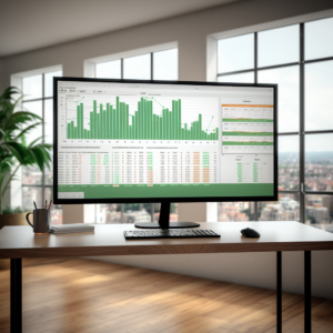
Excel is a powerful tool that can transform raw data into meaningful information. One such way of presenting data in Excel is by creating a dashboard. An Excel dashboard is a single page, often called a canvas, that uses charts, tables, maps, and other data visualization tools to present data. They can be designed for a specific purpose like tracking key performance indicators (KPIs) or for providing high-level views of large data sets. In this article, we will cover the basics of Excel dashboards, guide you on how to create your first Excel dashboard, discuss advanced techniques to optimize your dashboard, and give you practical tips for maintaining and updating your dashboard.
Understanding the Basics of Excel Dashboards
Excel dashboards are all about making sense of data and presenting it in a digestible, easy-to-understand format. They can be customized to suit your needs and can include charts, tables, slicers, timelines, and pivot tables. The first step to creating an Excel dashboard is to understand your data. You need to examine the data to see what story it tells. Then, decide on what visuals will best illustrate that story. Once you have your visual tools, you can arrange them on your dashboard to create a logical flow of information.
The second fundamental aspect of Excel dashboards is to identify your key performance indicators (KPIs). KPIs are measurable values that demonstrate how effectively a company is achieving key business objectives. Organizations use KPIs at multiple levels to evaluate their success at reaching targets. Identifying the right KPIs depends on your industry and which part of the business you wish to track.
Thirdly, a good Excel dashboard should be interactive. This means that the user should be able to control what they see on the dashboard. For instance, if your dashboard is tracking sales data, the user should be able to filter the data to see sales for a specific period or region.
Lastly, Excel dashboards should be visually appealing and easy to read. Avoid cluttering your dashboard with too many visuals or too much data. Use colors and fonts consistently and make sure your visuals are clearly labeled.
Step-by-Step Guide to Creating Your First Excel Dashboard
Creating an Excel dashboard might seem daunting at first, but with a systematic approach, it can be quite straightforward. The first step is to import your data into Excel and clean it up. This might involve removing duplicate entries, correcting errors, and standardizing data formats.
Once your data is clean, the next step is to create a pivot table. A pivot table allows you to summarize and analyze large data sets. You can use it to identify trends and patterns in your data, which can then be visualized on your dashboard.
After creating your pivot table, the next step is to create charts. These charts will form the basis of your dashboard. Excel offers a wide range of chart types, including bar charts, pie charts, line charts, and scatter plots. Choose the type of chart that best represents your data.
Finally, arrange your charts on the dashboard and add any other visuals that you need. Make sure to include a title for your dashboard and labels for your charts. You can also add a slicer to allow users to filter the data.
Advanced Techniques for Optimizing Your Excel Dashboard
Once you have created your basic Excel dashboard, you can use advanced techniques to optimize it. One such technique is using conditional formatting. Conditional formatting allows you to highlight specific data points or trends in your data. For instance, you can use it to highlight cells that are above or below a certain value.
Another advanced technique is using VBA (Visual Basic for Applications) to automate tasks. For example, you can use VBA to automatically refresh your pivot table whenever your data changes. This can be a real time-saver if your dashboard is tracking real-time data.
You can also use formulas to create calculated fields in your pivot table. This allows you to add new data to your dashboard that is derived from your existing data. For instance, you could create a calculated field that shows the percentage change in sales from one period to the next.
Lastly, consider creating a dynamic dashboard. A dynamic dashboard is one that changes based on user input. For instance, you could create a dropdown menu that allows the user to select which data to display on the dashboard.
Practical Tips for Maintaining and Updating Your Excel Dashboard
Maintaining and updating your Excel dashboard is just as important as creating it. One key tip is to keep your data source updated. If your data source changes, make sure to update your pivot table and any calculated fields that rely on that data.
Another tip is to regularly check your dashboard for errors. This can be as simple as checking that your charts are displaying the correct data, or as complex as checking that your formulas are calculating correctly.
It’s also important to review your dashboard regularly to ensure that it’s still meeting your needs. Over time, you might find that you need to add new data or change how your data is displayed. Don’t be afraid to make changes to your dashboard as needed.
Finally, don’t forget to back up your dashboard regularly. This will protect your dashboard against data loss and allow you to revert to an earlier version if you make a mistake.
Summary
Creating an Excel dashboard is a powerful way to make sense of large data sets and track key performance indicators. It might seem daunting at first, but with a good understanding of your data and a systematic approach, you can create an effective and interactive dashboard. Remember to maintain and update your dashboard regularly to ensure that it continues to meet your needs. Happy data analyzing!
Excel with interactive Excel Dashboards online course at Udemy is a great way to make the first steps in creating Excel Dashboards.
Excel is defiantly a great tool, but have you tried Google Sheets? Here’s a blog you would probably like, Excel vs Spreadsheets – pros and cons.