Data has become the new currency in this digital age, with businesses, organizations, and even governments capitalizing on it to drive decision-making, improve operations, and achieve goals. However, data alone can be difficult to comprehend, especially when dealing with significant volumes. This is where data visualization comes in. Data visualization techniques aid in making complex data more accessible, understandable, and usable. It is a critical tool in modern data analysis, unlocking the value of data by allowing for clear, efficient, and compelling communication of data-driven insights.
Unleashing the Power of Data Visualization
Data visualization is a powerful tool because it transforms raw, unprocessed data into a visual context that simplifies the interpretation process. It enables users to detect patterns, trends, and insights in data that would be challenging to uncover in raw, text-based formats. According to the Data Visualization Guide by Tableau, effective data visualization can accelerate the comprehension of data and enhance decision-making processes.
Moreover, data visualization is not only a tool for data analysts. Non-technical users also benefit from its power to present complex information in a digestible, visually engaging format. This democratization of data enhances collaboration across different functions in an organization, foster strategic decisions, and drive actionable outcomes.
Finally, data visualization offers tremendous value when dealing with vast quantities of data. It allows for easy identification of outliers or unusual data points, aiding in data cleaning and quality control. It also enables the compression of a large dataset into a simple visual representation, saving time and enhancing efficiency.
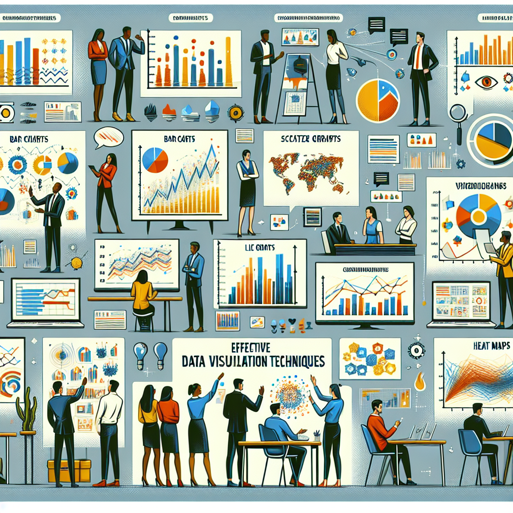
Techniques for Effective Data Storytelling
Data storytelling involves conveying data insights in a narrative format, making it more engaging and memorable. It combines data, visuals, and narrative to communicate information effectively.
One technique for effective data storytelling is to start with a clear, concise narrative. This narrative sets the context for the data and drives the direction of the story. It is essential to align the narrative with the goal of the analysis and the audience’s needs.
Another technique is to choose the right visualization type based on the data and the story you want to convey. There are various types of data visualization, from simple bar charts and line graphs to complex heat maps and geospatial data. Choosing the right type can help to highlight the essential aspects of the data and make the story more impactful.
Finally, effective data storytelling incorporates interactivity into data visualizations. This enables users to explore the data at their own pace and discover new insights. It also increases user engagement, making the data story more compelling.
Transforming Data into Actionable Insights
Data visualization plays an essential role in transforming data into actionable insights. It enables users to understand the data quickly, uncover trends and patterns, and make informed decisions.
The first step in transforming data into actionable insights is to understand the data’s context. This stage involves gathering relevant information about the data, such as its source, purpose, and characteristics.
The next step is data exploration, where users examine the data to identify trends, patterns, and outliers. Data visualization tools, such as Microsoft’s Power BI, can aid in this process, offering visual exploration features that highlight valuable data insights.
Finally, after identifying key insights, users can communicate these to stakeholders. Here, data visualization can help to present these insights in a clear, compelling manner, driving action.
Summary: Harnessing Data for Impactful Communication
In conclusion, data visualization is a powerful tool that can transform complex data into clear, understandable, and actionable insights. It allows users to see beyond the numbers, uncovering patterns, trends, and insights that can inform decision-making and strategy.
Moreover, by incorporating effective data storytelling techniques, data visualization can engage audiences, making data more memorable and persuasive. It allows for the seamless integration of data, visuals, and narrative, creating a compelling data story that resonates with the audience.
Finally, data visualization plays a crucial role in transforming data into actionable insights. It facilitates the data exploration process, aiding in trend and pattern identification. It also provides a clear and compelling medium to communicate these insights, driving action and decision-making.
As we delve deeper into the digital age, the importance of effective data visualization techniques cannot be overstated. They not only simplify the understanding of complex data but also foster impactful communication of data-derived insights, ushering in an era of evidence-based decision-making. Harness the power of data visualization and transform your organization’s data into compelling, actionable insights. Let your data tell its story and drive your strategy into the future.